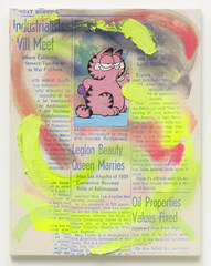
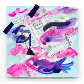
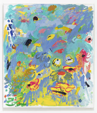
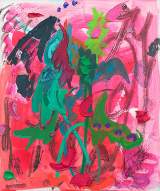
One of my favorite things to google is 'artists who make ugly art'. The main reason for this is that I like seeing what everyone's opinion is on what ugly art really is. I frequently see articles that talk about artists who are challenging the typical ideals of beauty and one in particular talked about Laura Owens. The image that drew me in was on painting of random swipes of neon paint over a magazine article with a picture of Garfield the cat in the middle. My immediate reaction was not that the art was ugly, but that it was not particularly 'good' or interesting. I headed over to her website to see what the rest of her work looked like and I was shocked to see pieces that I actually liked. I definitely would not call her art ugly. It is messy but that is her intention (i'm assuming). I feel like I say this about most artists but I love her use of color. The first thing I'm drawn to in a piece is usually the color scheme and she understands color theory pretty well. Her work reminds me of work I have attempted to do in the past but have not executed well. I did not expect to like her art or be inspired by any of her pieces after researching her but now I want to go back and try making more abstract expressionist pieces.
This week I began working on the techniques I am going to be using on my home project. I'm still working with watercolor, however this time I am going to try and paint slightly more realistically than I painted my last piece. This gives me the opportunity to try and figure out where I want to be in between abstraction and realism without using class time to stress about it. The subject is going to be more of an object rather than a space.
For this awareness post I wanted to make myself aware of artists that are not known for their fine art, rather for their music or acting. This awareness post is about David Bowie because I recently found out that he also painted all his life. When I first saw his art I was shocked and amazed at how interesting and beautiful it is. His body of work feels very raw and focuses a lot on the human body. He frequently abstracts the body or emphasizes the proportions of certain parts. He also includes some animal motifs, most frequently being monkeys and horses. Some of my favorite pieces I have seen of his are his sketches. They are full page color drawings of people and shapes but the way he uses color and line captures his essence so well. His body of work seems to have unifying themes and appears developed which makes me sad that he was not more known for his fine art. Either way, I am glad I looked into his work and I am not inspired by his use of color and the expression in his work.
This quarter I went to a few different exhibitions but by far my favorite one was InLight! This was my third year going to it and each year has shown completely new and interesting works of art. My favorite part about the location of the festival this year was that there was art in between galleries that also had more art in them. So much art!!! The entire concept of creating a three day art installation based on the theme of light is so creative and fun and it has never once been boring. This year, many of the pieces were a lot larger because the spaces in between buildings and in parking lots were larger. I appreciated the mix of simple projections on walls and actual 3D glowing sculptures. There is a lot of participation in the festival including a parade down the middle of the street which I think is a really cool way to involve the public in an event like this. I liked the combination of light with other elements such as performance pieces and sound but my favorite pieces were the ones that played with color and the mixing of color. I hope in the future when technology evolves more there are more holographic pieces.
|
AuthorGrace Barron Archives
June 2018
Categories |