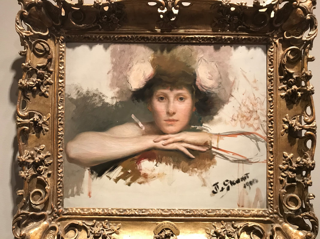
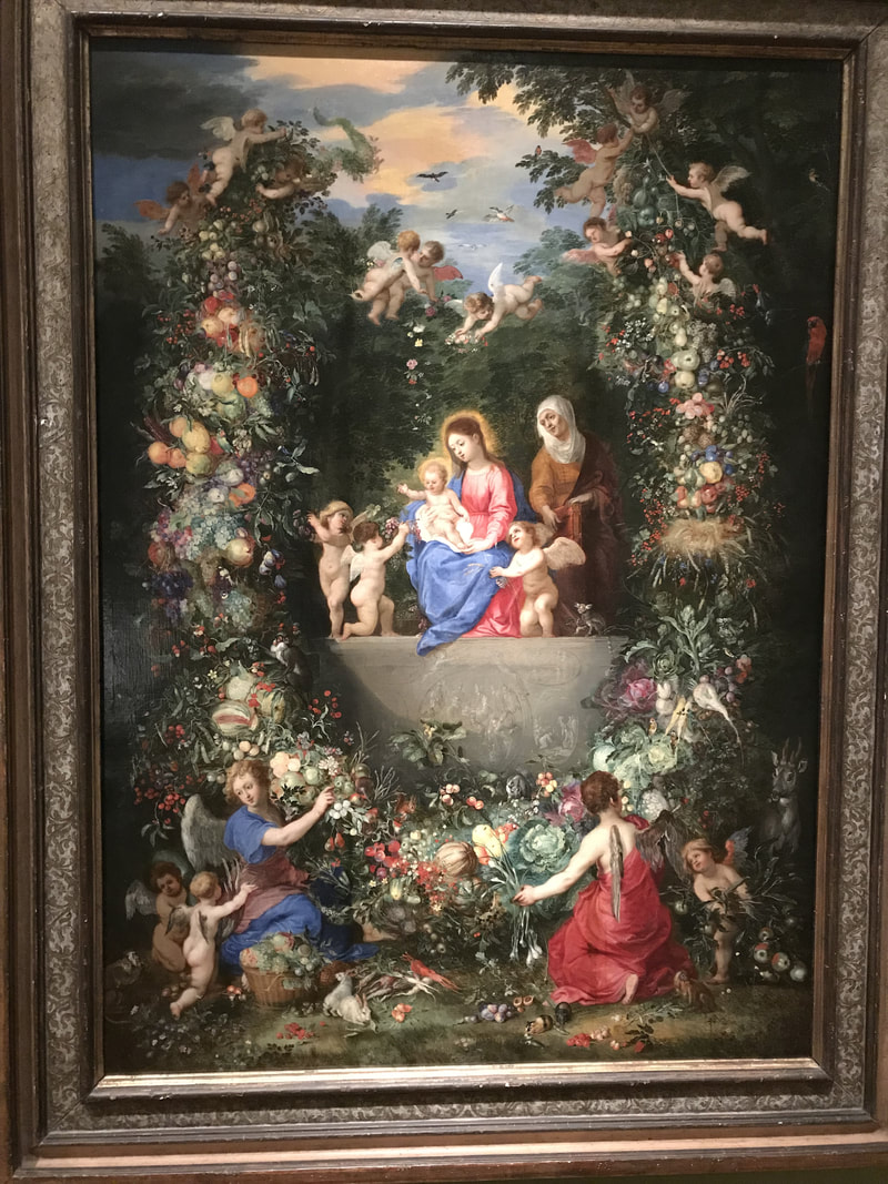
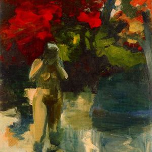
This quarter, my British Literature class went on a field trip to the VMFA to look at English art. I frequent the VMFA a lot, however I have never focused too much on the British or British-influenced art. This trip forced me to take my time appreciating art I don’t get to appreciate a lot. As a part of our assignment, we had to find pieces that somehow related to the different works we read in class. While I was looking for a piece that represented Shakespeare's Othello, I found a beautiful portrait of a woman in the American gallery. The edges of the painting are unfinished which gives the painting a strange feeling. It's typically expected that portraits are incredibly finished pieces without any mistakes. It's interesting to see a painting that I feel should be finished when it's not hanging in a gallery. Another piece that I was drawn to is a painting of Mary and baby Jesus from the Baroque gallery. I think the intricate paintings of fruit and flowers surrounding the scene is what interested me the most. I also love the bright repeating patches of blue and red cloth throughout the scene. I'm typically more interested in the art I can relate more to my own work, however on this trip I focused more on the beauty of very classic-looking pieces.
|
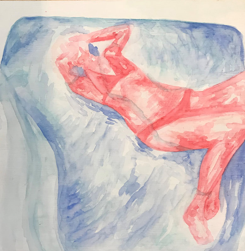
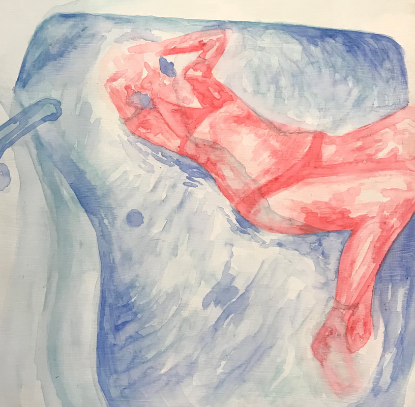
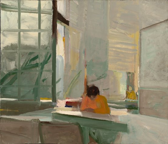
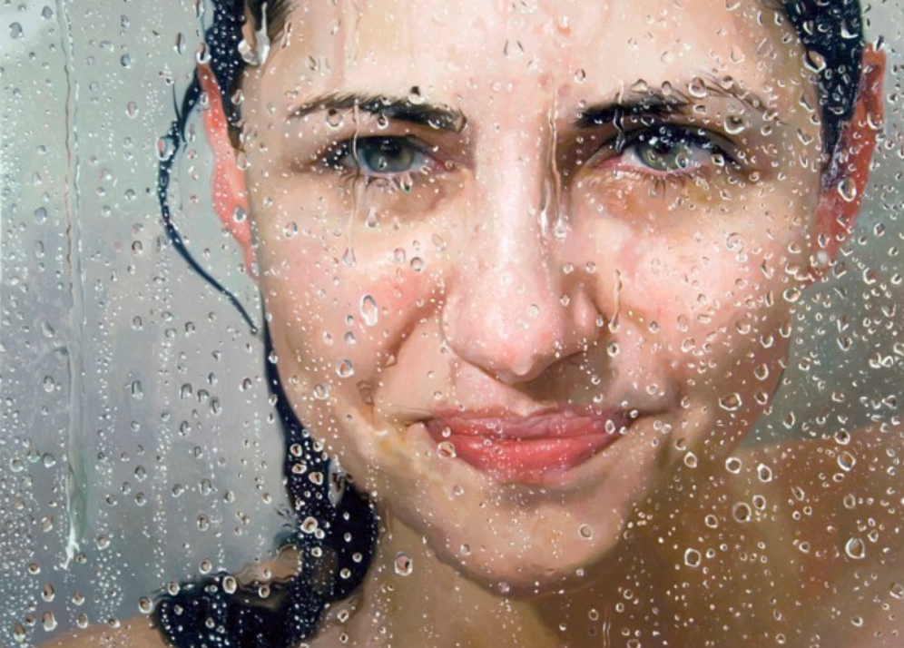
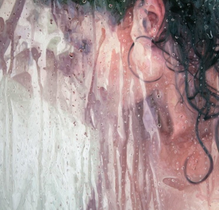
Elmer Bischoff started out experimenting with surrealism and abstraction when he started as an artist, however he began to work figuratively in 1952. He was part of the post-World War II artists that experienced this switch from more abstract to more realistic work. After roughly 20 years of working figuratively, he returned back to abstract work full of color and light. He is most well known for his figurative work. I came across his piece “Orange Sweater” (pictured below) in one of our art magazines while looking for some inspiration. Although his work is unrelated to what I’m currently making, a lot of it has similar elements to the work I used to make last year. Bischoff uses oil paint to make rough, fuzzy, and colorful paintings of different scenes and people. He uses wide strokes of paint and layers of colors to give the essence of a greater form or scene. I think part of what drew me to his work is that I miss doing my paintings where I studied spaces and tried to represent them with little detail. The cool thing about his paintings is that he paints on an incredibly large scale as opposed to my smaller paintings. This allows him to be more generous with his stroke and blocks of color. I wish I had found his work last year to give me inspiration, but now I’m more inspired to try and create more paintings like I used to. Alyssa Monks is an artist I stumbled upon while looking for inspiration for my new water-related pieces. Monks makes large, hyperrealistic oil paintings of people in water or people obstructed by wet and foggy glass. The biography of Monks on her website says that she “blurs the line between abstraction and realism by layering different spaces and moments in her paintings.” When I first read this I was incredibly intrigued because I have very similar goals for my own body of work. What was even more interesting to me is that our bodies of work may have similar messages but they look absolutely nothing alike. We use different mediums and I focus more on the abstract element of painting rather than her focus on the concept of abstraction. I can learn a lot from her though, including how she uses mark to make her paintings more expressive and texturized. Although I use a different medium, Monks proves that mark making is still an important part of any painting. Monks has been working on her water series for 10 years, however she also does paintings that combine the images of figures and nature scenery. I noticed how she applies the same ideas of multiple planes of space and combines them into one beautiful painting. In some of her older work, she did paintings landscapes and scenes without a figurative element. I similarly used to do paintings of landscapes before I settled on my pool/bathtub path which I thought was interesting. Overall I’m in love with her work and I appreciate how she can still get the photorealistic effect while still having an expressive mark. The two articles I read both dealt with the idea of artists depicting the pain, suffering, loss, and tragedy that accompanies war. The first one, titled “Horror is a Constant, as Artists Depict War,” addresses the shift from paintings glorifying war to paintings that highlight the horrors of war. The second article, titled “When Modern Art Met Modern Warfare,” talked about the different forms in which art about war took on. Artists like to make art about subjects that get the viewer to stop, think, and feel something they may not have felt before. The topic of war is touchy for most people and is often ignored on a daily basis because it is devastating to think about. Artists take this idea of war and depict the very subjects that people are trying to avoid--death and mourning.
This trend of making art about the tragedies of war really took off around the time of the World Wars. Prior to these wars, war heroes were often painted to look like powerful and hopeful figures. These grand paintings overshadowed what really happened in the wars and drew people’s attention away from the real conflict. The first article mentions the fact that “. . .many artists focused on war at the behest of their governments or rulers. They were commissioned to show war’s achievements, but often, their eye caught something different” (page 3). Commissioned war paintings inevitably died down, which is likely why artists branched out and focused more on the bad parts of war rather than the ‘good’ parts of war. The second article discusses how as warfare evolved, so did modern art. The article uses an example from sculptor Jacob Epstein who completely changed his sculpture to address a new issue. Curator Paul Moorhouse said that “His art responds to his experience of war” (page 1) which is different for every artist who makes art about war. Another example of an artist is Kaethe Kollwitz, who focuses on the mourning aspect of war because she lost her son to the war. Her work was much more dramatic and somber because of her specific feelings and attitude towards war. I’m glad that artists are bringing light to something that many people like to shut out of their minds. War is an uncomfortably common thing in the world. Most people who are not immediately affected by it tend to forget that it’s even happening. By making work centered around this conflict, it makes people think more about why we are fighting in the first place. I don’t think anyone necessarily likes war but we tend to normalize it. Making people uncomfortable in this situation is a good thing. The world needs to realize that we should not celebrate war, normalize war, or forget about war. Artists are using their platforms and their work to make a well-needed statement about the state of the world. This is something that most other people are too afraid to do. |
AuthorGrace Barron Archives
June 2018
Categories |
 RSS Feed
